





















































A product page does more than just sell your product — it gives shoppers an opportunity to learn about your product, check it out in greater detail, and determine the value it brings them.
Your product page is the customer’s first experience with your product, with your brand.
Conversion Rate Optimization is the art and science of persuading customers into buying.
CRO is a subset of online marketing focused on improving how many people complete a desired action. As ecommerce marketers, that means increasing how many people buy our product. It can also mean increasing how much shoppers spend while they’re in our store. It can even mean getting shoppers to share their love of a product.
Whatever your goal, CRO can help.
The steps below are geared toward helping you make sure you don’t miss any opportunities for conversion — no matter what your goal is.
In this guide, we’ll show you how to create a product page that boosts conversions and increases sales. As an added bonus, we’ve created a comprehensive product page checklist (Step 2 below) for you to follow along with as you create your own high-converting product pages.
Here are the eight steps to creating an effective, engaging ecommerce product page that drives sales and delights shoppers.

Understand your potential customer’s journey. The more you know about how your audience shops, what problems they want solved, and where in that purchase cycle they are, the easier it will be to create pages that convert.

Know your audience. Know your product.
If your goal is the sale, then you need a product page that provides value for your customers across the journey’s spectrum and nudges them ever-so-sweetly into the next phase of the journey, down the sales funnel and through to checkout.
Let’s look at how some brands are providing value at every stage in the customer journey:
Everlane
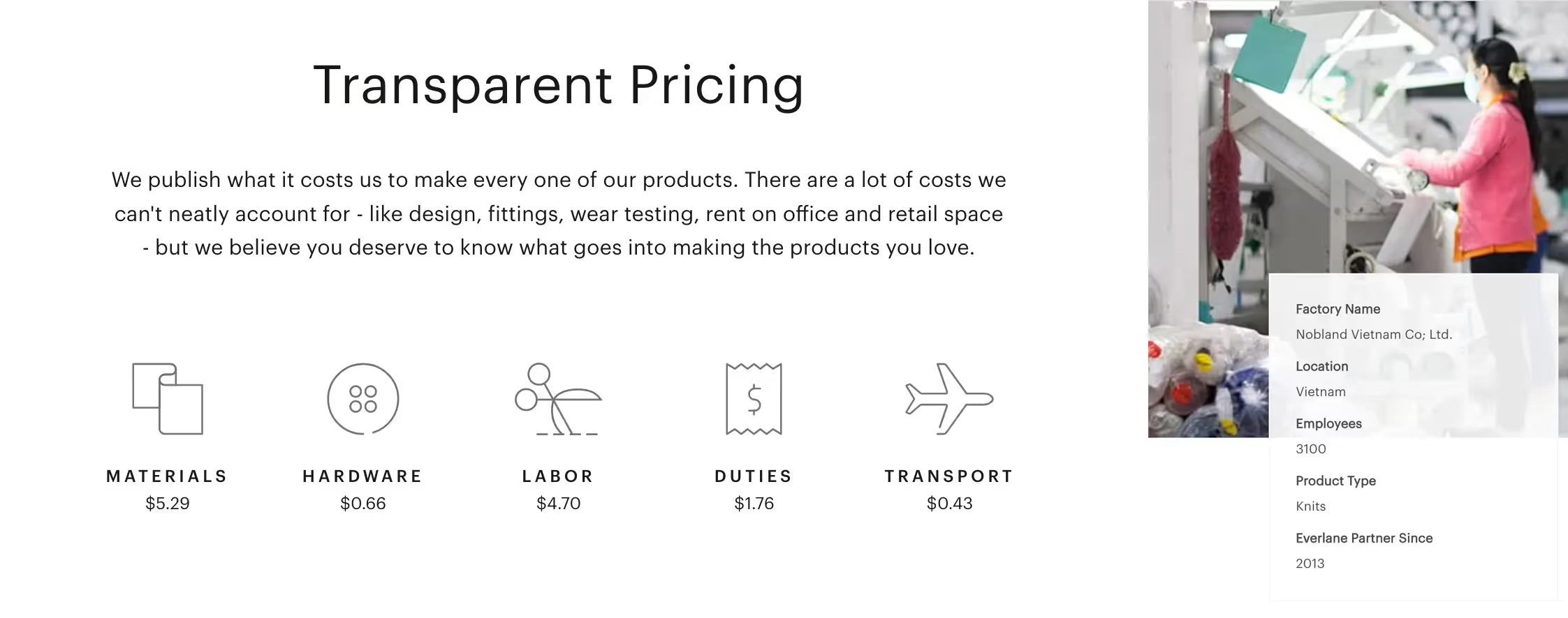
Total transparency. You would think Everlane’s philosophy of transparency would put it at a disadvantage in customer education. If they share too much, shoppers might question the value. Right?
No. By being totally upfront about material, shipping, and production costs, they quantify the quality of their products and justify the price.
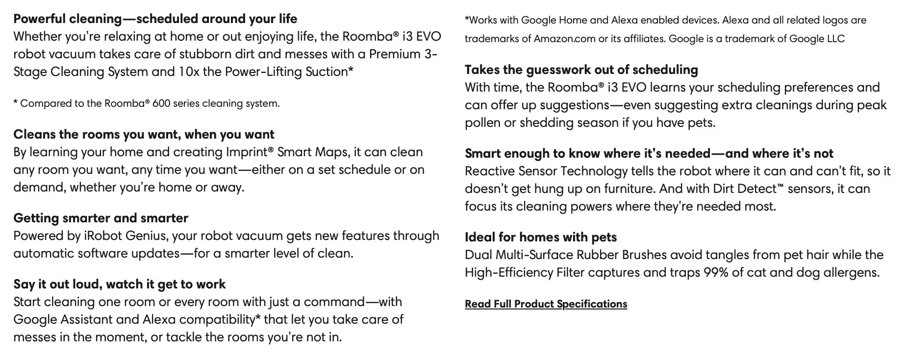
iRobot
Differentiating Roomba product lines based on key features. By isolating these features, they’re also distancing their products from competitors in similar price tiers whose features don’t compare.

These product lead-in phrases may be short and sweet, but they pack a punch.
Alo Yoga
Succinctly giving their shoppers the exact details they need in the exact format they want.
Benefits and features are clearly listed as bullet points in the description. But it doesn’t stop there. Alo goes on to include Fit bullet points that give shoppers a more precise understanding of what to expect.
Then, Alo gives shoppers a brief but deep dive into even more features and benefits using strong keywords that resonate and boost SEO:
They even go into detail about free shipping to the visitor’s location and inform them that returns are also free — plus, it includes a prepaid label so there’s no need to find a printer.

Chubbie’s
A rewards club that is easy and fun to use. Chubbie’s knows its audience well and incentivizes ambassadorship and return purchases.
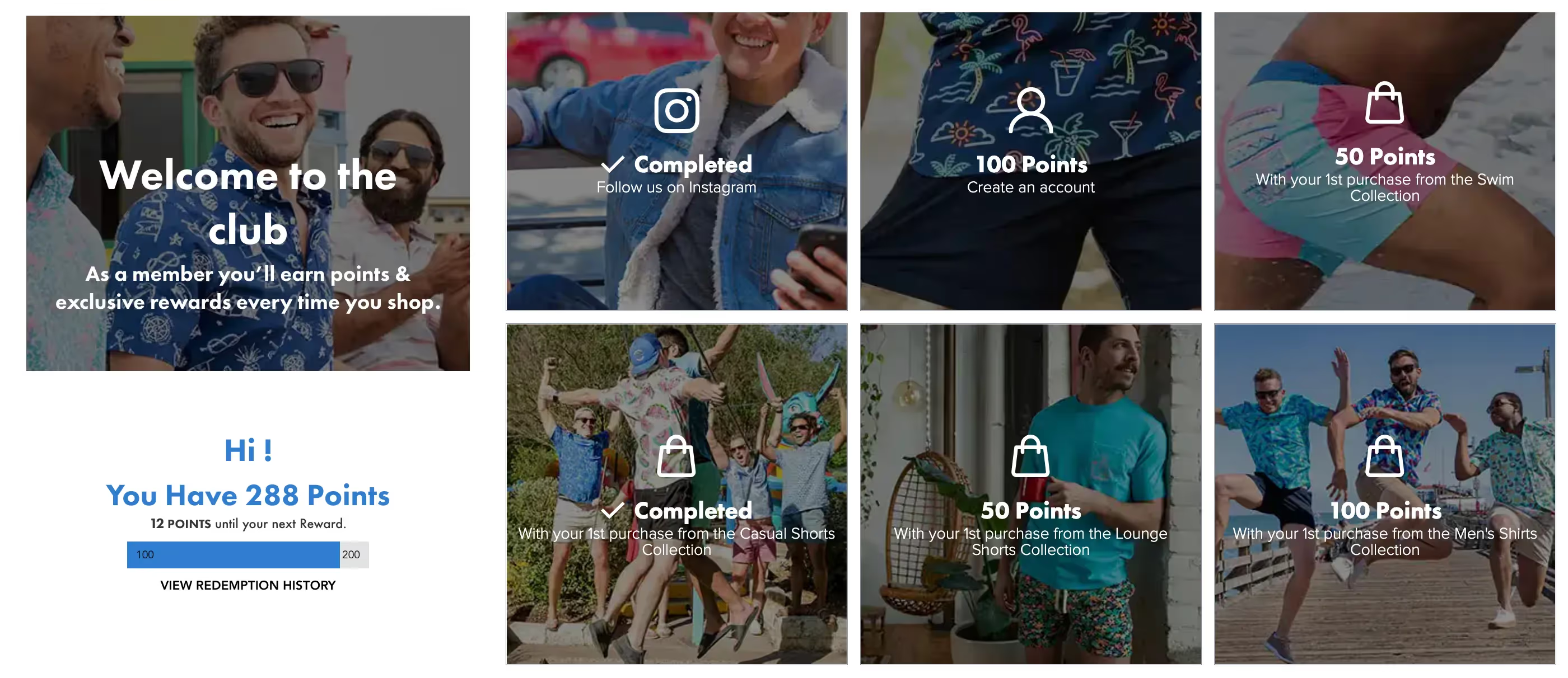
With Chubbie's rewards program, customers gain points that can be exchanged for gifts and discounts on future purchases.
The key here is Chubbie's transactional approach to micro conversions. Rather than hope visitors sign up to the newsletter or follow them on social, Chubbie's gives them a quantifiable reason to.
Here's why incentivizing loyalty actions makes sense:
As a marketer, the whole program feels well-thought-out. As a customer, it feels personalized and exclusive; like an actual club with perks and a sense of, well, being part of something cool.
When creating a product page, it’s important to get your foundational elements right.
Build out sections of your page that answer all of your customers’ fundamental questions, such as what is it? or how does it work?
Make sure you have clear call-to-actions, including some sort of on-page navigation for shoppers. Check out our checklist below for more details on how to build out your product pages.
Having a checklist can help you with content, copy, and overall product page design. It will not only keep you focused on what’s most important but also allow you to tackle these elements one at a time and be able to judge your results more easily.
Before you begin building out your product pages, make sure you ask yourself the following questions:
Here is the 4-point framework we use on our top-performing product pages:
Showrooming refers to shoppers examining products offline at brick-and-mortar stores, and then buying online.
The goal here is to provide shoppers with that showroom experience while they’re on your product page. Here’s a quick sub-list specific to product images and videos:
NOTE: More info on the Showroom concept can be found in the next section (Step 3).
The majority of ecommerce apparel returns are due to customer dissatisfaction with fit. Accurate sizing data in easy-to-understand presentations on your product page can not only improve conversion rates from new visitors, but it can also reduce returns from previous buyers.
Here are some examples of companies using sizing and dimension data in useful ways:
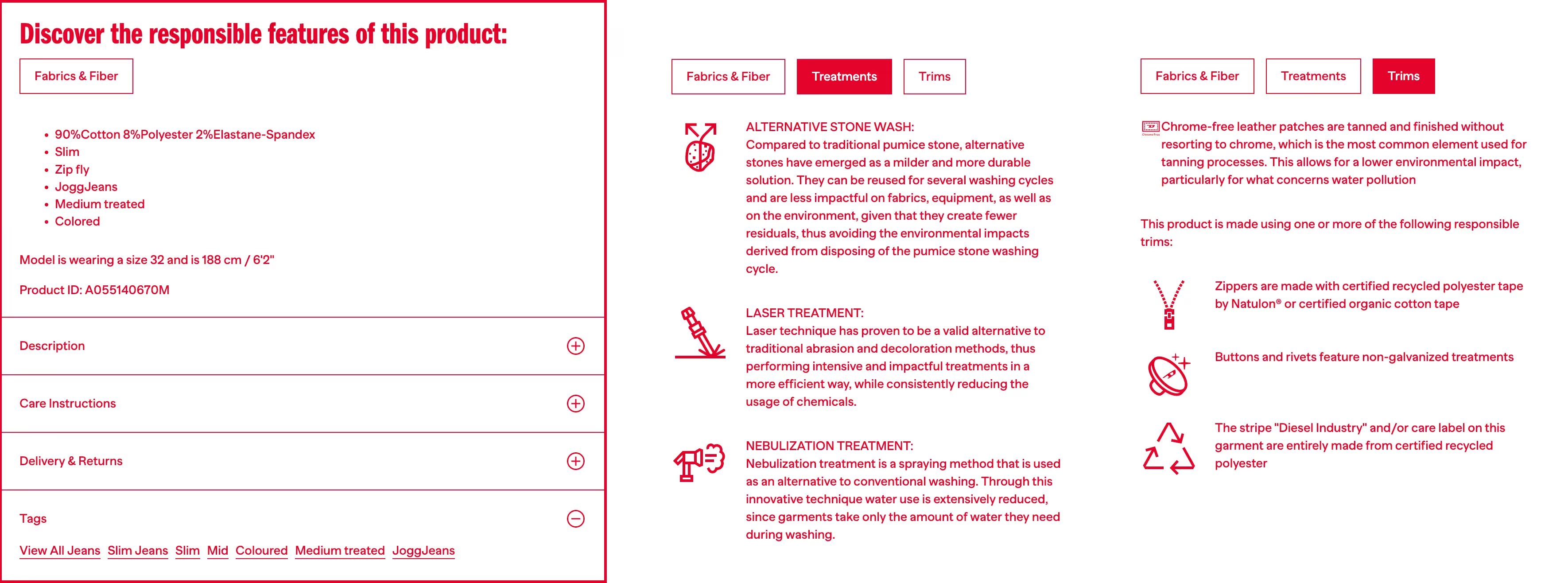
Diesel uses Fit Analytics’ Fit Finder to help its customers find their exact fit.
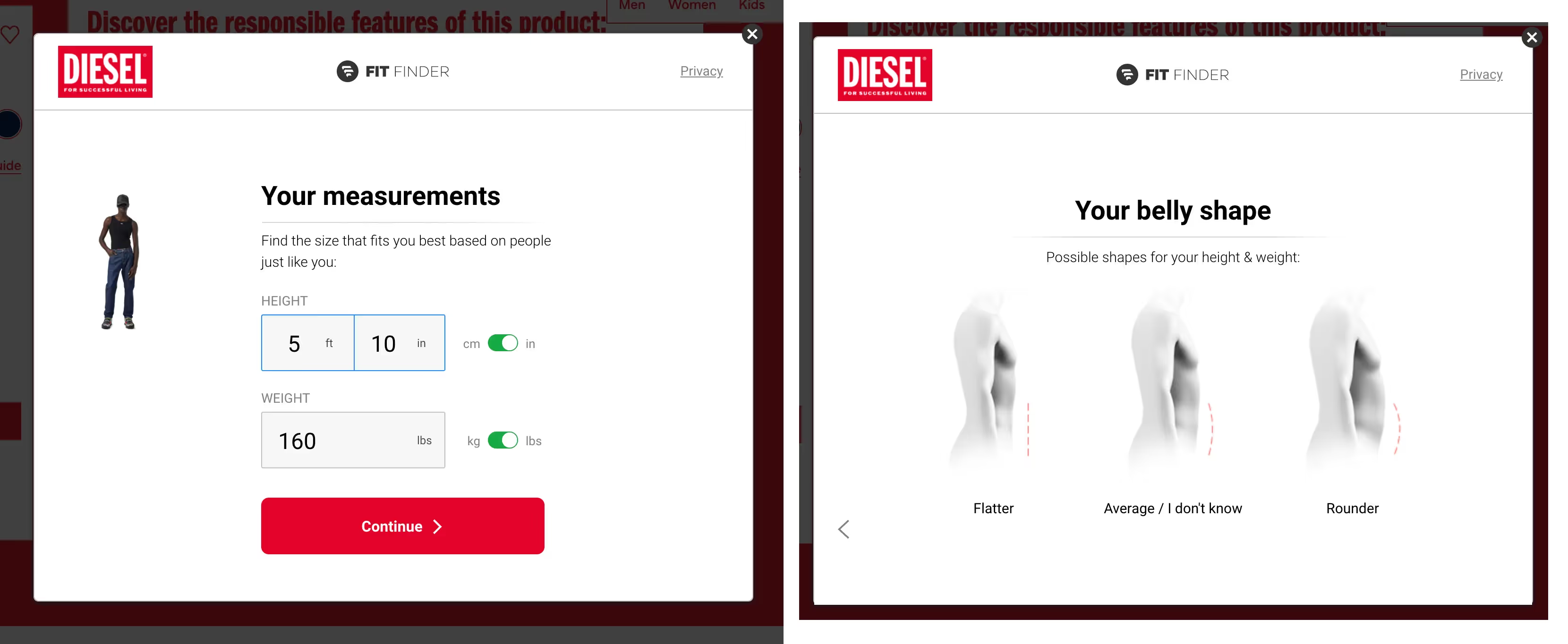
They also provide their model’s size and dimensions to help shoppers visualize the fit.
Spanx gives shoppers a sizing chart unique to the product category they’re on. For example, shoppers looking at leggings will see one chart, while shoppers looking at shorts will see this chart.
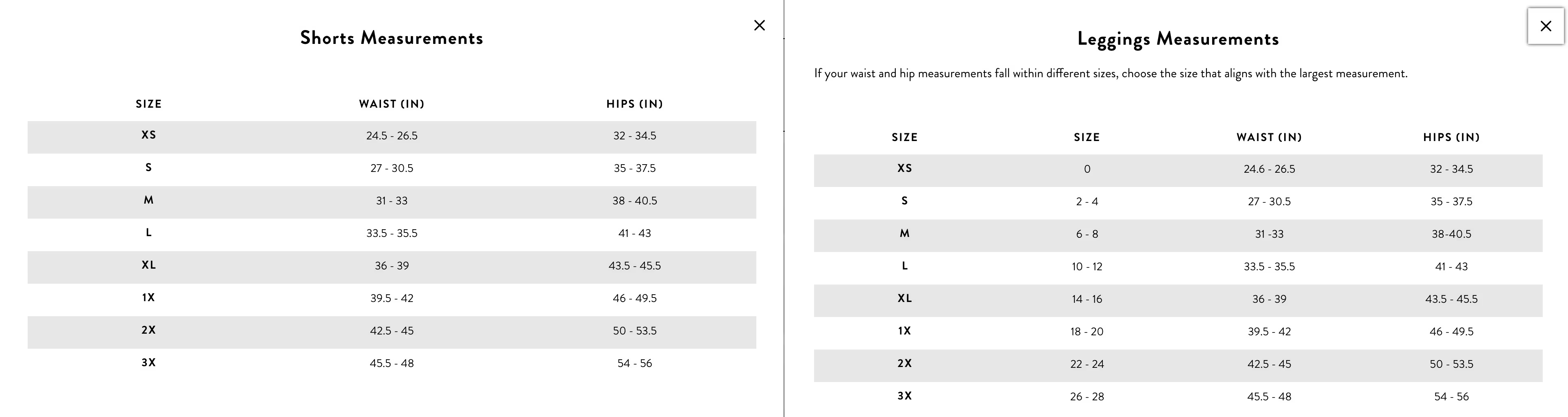
By providing sizing guides that match the product category their shoppers are currently viewing, Spanx reduces data overload and makes it easier to find the right fit. And although that may sound intuitive — even expected — not all retailers do this.
Blenders also cuts down on data overload by forgoing sizing terminology altogether. Instead of a chart that explains rim size, bridge width, and temple length, shoppers get a clear diagram of the exact product they’re looking at with sizing dimensions overlaid.

Shoppers know a great product description when they see it. It gives them all the details they want to know without making them feel like they are digging to find them.
A great product description is useful. It’s informative. It’s entertaining, even.
A great product description tells someone why they would want your product and educates them on how to get the best use out of it.
So how do you achieve this holy grail of product prose?
We use this Shopify checklist:
It’s a long but worthwhile read if you have the time.
Bullet points are the cherry on top of the product description. Good use of bullet points will reinforce your product’s value and highlight the key selling points.
So what do you put into your bullet points? That depends on your products and categories, but there are some foundational rules to follow.
Here are a few great bullet point examples:

You may recognize this point from our checklist earlier. It’s a key piece of the product page optimization process so we'll expand on it in this section.
The reason why is pretty simple.
Ecommerce opens up a whole world of opportunity — quite literally — but it comes with its own challenges. Namely, the sensory problem. We’ve already dis
In other words: your target audience can't actually touch, taste, or see products in real life before they decide to buy. And that plays an (understandably) massive role in their decision-making process.
So, if you want to get the sale — you’re going to need some stunning product photography. And that means your product imagery will have to be:
Unless you’re Amazon, people will rarely go to your website directly while searching for a product. Just like everyone else, you’re relying on search engines to get your target audience to your website.
And that means every product page should be optimized for maximum visibility on Google. Here are some of the ways to make that happen:
As any digital marketer worth their salt will tell you, understanding the psychology behind why people make certain decisions while shopping and browsing is vital for increasing your conversion rates.
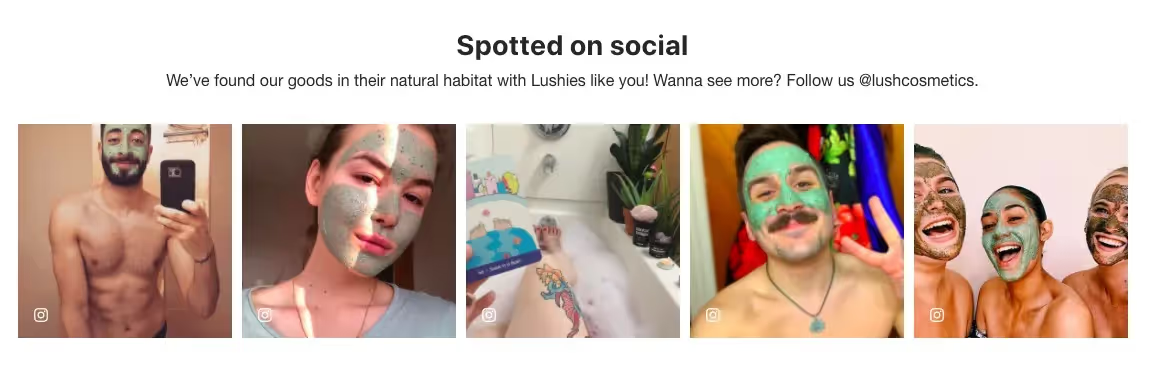
For instance, social psychologists have long been fascinated by the notion of "social proof." Basically, the idea is that people who are faced with a lack of experience and knowledge or fear of making the wrong choice will prefer going with what others have decided before them.
And in the context of ecommerce, that means using testimonials, reviews, various other user-generated content, and trust signals.
The competition on eCommerce websites is immense — and it only takes a couple of moments of frustration for a user to decide to close their tab and search for another online store. Considering that, focus on improving the user experience if you want to attract, retain, and convert more people.
For example, you can do that by working on:
Sure, it’s easy to get distracted and focused on smaller details that really aren’t all that important. But getting the big things right first is essential for conversion optimization.
The Big 3 elements on your product pages are the same three elements we harp on when it comes to product feed optimization:
Why? Because these are the three things shoppers zero in on first.
If you want your product page to convert, start by making sure your title is as accurate as possible; if people can’t find what they're looking for or pick up on keywords within seconds of visiting your site, they'll move on (and probably never come back).
Next, be sure you have a useful product description with plenty of relevant information and calls-to-action.
Finally, don't skip out on showroom-level product images — they may take time and effort, but this prime real estate on your page will pay off over time.
The only way you’ll know if one product page element converts better over another is by split testing elements.
Here are the tools we use and why we like them:
Google Optimize, is a free Google tool to test page elements. The 6 tests we run on Google Optimize are:
Google Optimize is a great option for new testers who don’t want to invest in a paid tool just yet. Google Optimize, however, has its drawbacks. Its code can be cumbersome. Its performance can be finicky. Testing is limited to very few pages at a time.
For that reason, we recommend trying more advanced CRO tools. And although these tools can be costly, they give you the best path to clarity.
Hotjar is an insights tool that uses heatmaps, session recordings, and surveys to give you experiential feedback of your product page.
It comes with a pretty decent free-forever option, but more even more obust paid plans are available starting at $39 per month.
VWO is a powerful, yet affordable CRO tool. It’s powerful enough for the pros, but intuitive enough that anyone can use it — and it starts at around $200 per month.
It has an easy-to-use visual editor that let’s you see what your product pages will look like as you edit them. This makes A/B testing not just easy, but also kind of fun.
VWO lets you set up campaigns and experiments using a variety of page elements, events, tags, audiences, and more to target and evaluate how shoppers experience your product pages.
Tests you can run using VWO include:
Getting VWO running on your website is fairly easy too. To get started, you need to copy and paste its SmartCode — a small snippet of JavaScript — into your site’s closing </head> tag.
After reading through these steps, you should have a clearer idea of how to create product pages that convert.
Remember that it’s important to use these ideas as a starting point. Customize them to fit your brand's style as well as your customer's needs. Before you know it, you’ll be making an impact on conversion rate and driving sales.

Bryan is a digital marketer with roots in journalism and creative writing. Over the past decade, he's helped hundreds of online retailers develop and implement ecommerce marketing strategies. When he isn't educating retailers on ecommerce, he's out exploring South Florida and stalking local breweries.
Run a free feed audit and see which of your titles are matching queries you'd never choose to bid on.

.avif)