The final leg of a successful Google Shopping campaign is less about what you do on Google and more about how you tie the overall strategy together. Even if you’ve done everything right up to this point, a poor shopping experience can cost you a sale.
So what can you do to salvage -- nay -- delight customers? Reduce friction.
A successful Google Shopping strategy will culminate with a frictionless shopping experience on your site. But what does that mean? Usually, it means an intuitive, shopper-friendly landing page and a smooth checkout process.
Let's start with landing page optimization.
Landing Page Conversion Optimization
Landing pages for Google Shopping campaigns are your product pages. And while product page layouts will vary depending on your shopping cart's page structure and internal design, the key conversion optimization elements should remain consistent.
Elements of a great landing page:
- Establish trust
- Clearly explain the benefits of the product
- Narrow the shopper’s focus
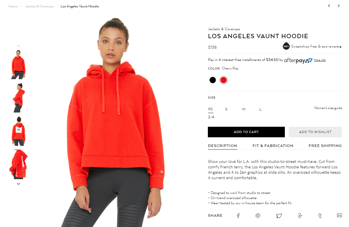
Source: Alo Yoga
Let's review these elements in more detail:
Establish trust
Making a purchase -- online or off -- creates an inherent sense of distrust. Is this the right product for me? Is this the best price? What if it doesn’t work out? Buying online raises the stakes. Will I get it on time? Can I trust this seller to make things right if I’m dissatisfied?
The first step toward dispelling distrust is to address these questions head-on. Create a list of questions your customers might have. Then, write a 1 to 3 paragraph blurb to answer each question.
Next, leverage previous buyers’ experiences to assuage future buyers. Follow up on every purchase with a customer satisfaction email. Ask them about their experience with your store. If they had a great experience, ask them outright to “help” you spread the word by sharing it with fellow shoppers on your site (provide a direct link to the review page). If they had a bad experience, do your best to resolve the problem for them.
Finally, invest in trust “badges” and make them visible on your landing pages. Security credentials like Symantec, Verisign and GeoTrust let visitors know that your store takes security seriously. Payment and shopping badges like PayPal Verified, buySAFE and BBB Accredited Business let shoppers know there are safeguards in place to protect their purchases.
Explain benefits of the product
Relying only on titles and descriptions to explain the benefits of your products will result in lackluster, inefficient product pages. Instead, use a variety of page elements to make your products shine.
- Sections in text - Break up benefits using headers and blurbs.
- Question/answer formats - Know your customers’ questions and answer them right in the benefits section.
- “Callout” blurbs - Highlight your strongest points in a graphical “callout” format.
- Bullet points - Use bullet points for easy scanning of benefits.
- Icons/graphical elements - Use icons with text to break up the page and highlight key aspects of your product.
- Additional images (with alternate angles, sizing, specs, etc.) - Use non-standard product images as a backdrop for bullet points or “callouts”.
- Video - Use video to explore products in detail or to quickly elaborate on its benefits.
- Expert quotes - Use expert quotes right on the product page alongside your core text to reinforce the product’s benefits.
- Review “pull quotes” - Create “pull quotes” by highlighting key parts of favorable reviews.
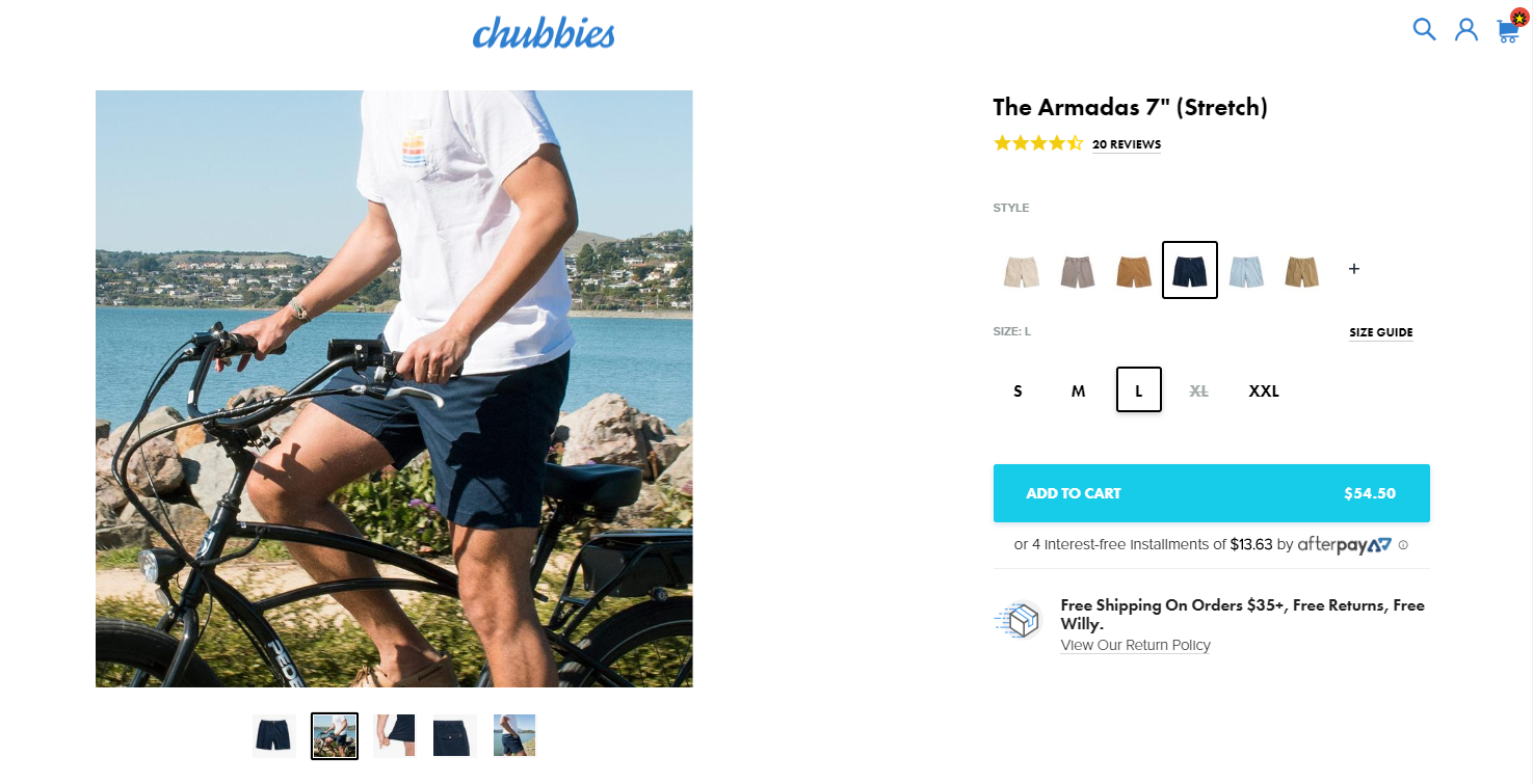
Source: Chubbies Shorts
Narrow your shopper’s focus
With every new visitor comes opportunity. Not just to buy a product but to become a lifetime customer.
In an ideal world, a visitor would come to your site, add the product to his cart, add additional products, sign up for the newsletter, follow your store on Facebook, Twitter and Instagram and share his great experience with his friends. So it’s understandable to want to push non-transaction goals to all shoppers. But at what cost?
The primary goal of a product page is to convert sales. When other goals are featured too prominently, they can distract from the primary goal.
Similarly, product pages that show too many products alongside the main
Optimizing the Checkout Process
The checkout process should follow one simple rule: Create the shortest distance from Point A (product page) to Point B (“thank you” or receipt page). That means not wasting any of your shoppers’ time with unnecessary processes that will annoy shoppers and risk cart abandonment.
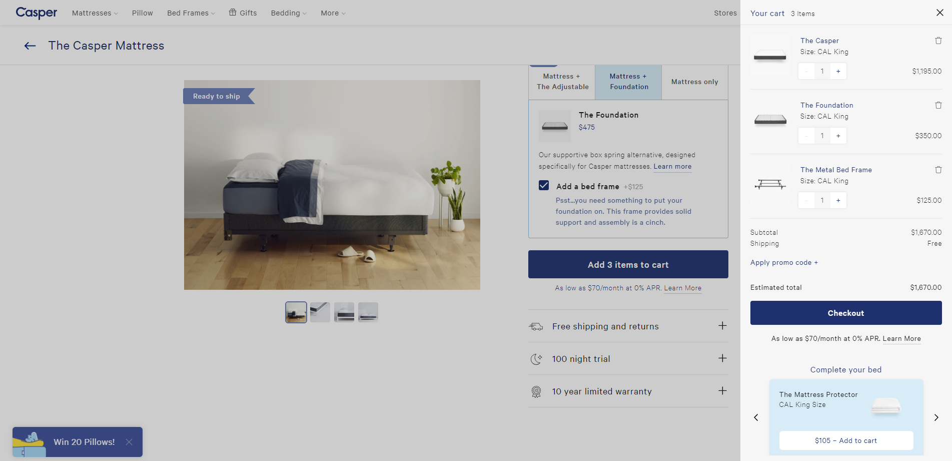
Source: Casper
The checkout process is the last hurdle to completing a conversion. Make sure it’s quick, smooth and user-friendly.
Here's how:
Avoid external checkouts
A visual disconnect between the checkout and your Website can contribute to cart abandonment -- especially if the URL changes and users feel like they’re no longer on a site they recognize.
Simplify the checkout page
The checkout page should be isolated. No distractions (like other products, social media links, etc.). Don’t give shoppers a reason to leave the checkout.
No sign-in barriers
The reasoning here is, if they create an account, they’ll come back and buy again. The problem, though, is that it happens at the beginning of the checkout before they can complete the purchase.
An alternative is to prompt a “create account” option after the purchase is complete.
Use multi-step forms wisely
By design, multi-step checkout forms give shoppers multiple opportunities to abandon cart. Save your shoppers the hassle of extraneous clicks by using a single page form.
Some modern shopping cart platforms now offer optimized multi-step checkouts designed to minimize abandonment because they transition seamlessly from one stage to the next and give users a preview of what to expect.
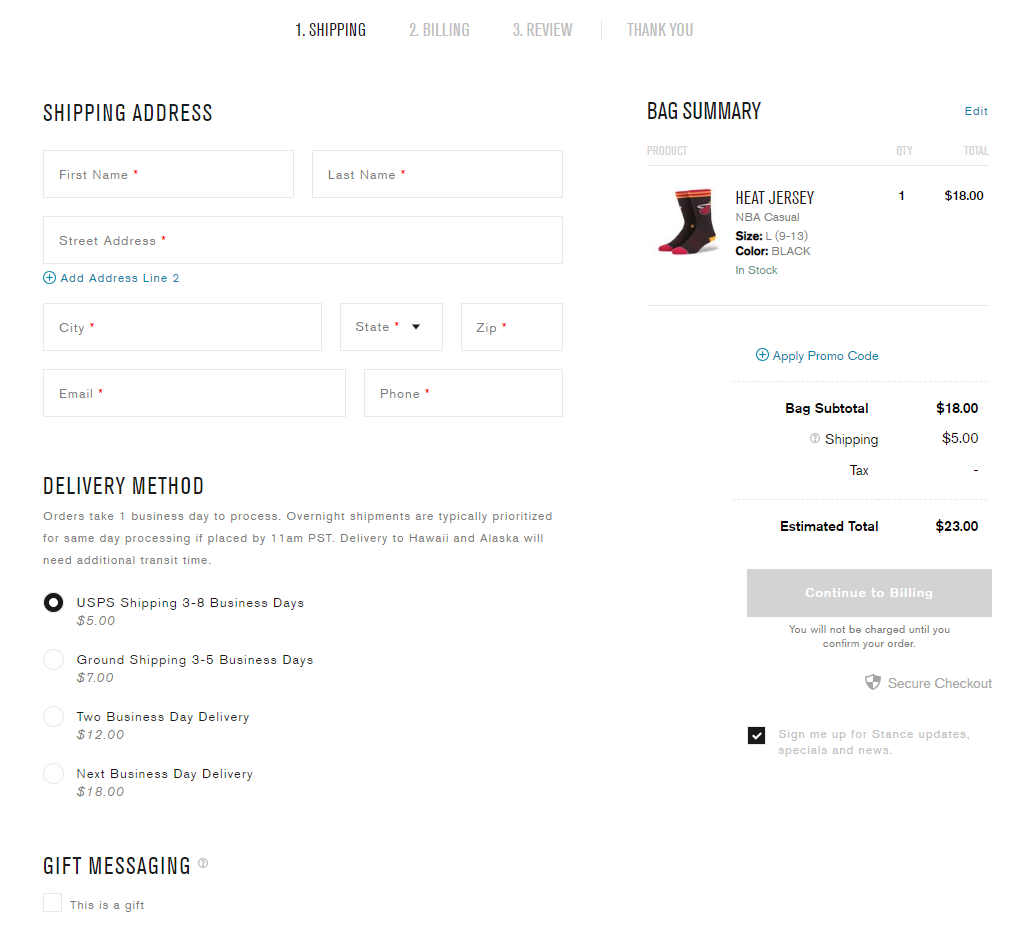
Source: Stance
If these are available to you (and you want to use them), A/B test the difference first. Only use multi-step checkouts if your A/B tests show now loss in conversions.
Long forms to fill out
Unnecessary fields will give your shoppers pause -- Why do I need to put in my phone number to buy a t-shirt? -- and have the potential to stymie the purchase.
Billing before shipping
Don’t get ahead of yourself. By asking customers to enter billing information before shipping, you allow doubt to creep into the process.
Providing shipping details and letting them choose when and where their purchase is shipped -- before they commit to buy by entering payment information -- will reduce dissonance and make them feel more comfortable about proceeding with their purchase.
Final Notes on Conversion Optimization
If your Google Shopping campaigns aren't doing so hot -- even after you've optimized your product feeds and implemented campaign optimization best practices, then it's time to optimize for conversion.
By reducing friction on the landing page and checkout, you'll boost your chances of a sale. It's simple, really.

Bryan Falla
Bryan is a digital marketer with roots in journalism and creative writing. Over the past decade, he's helped hundreds of online retailers develop and implement ecommerce marketing strategies. When he isn't educating retailers on ecommerce, he's out exploring South Florida and stalking local breweries.
.png)

.png)